How to Create Lifestyle & Personal Brand Content in Adobe Express
Everyday photos can make some of the best social media content, especially when you find simple ways to make them feel a little more creative and intentional.
Welcome to the fifth and final installment of Express Your Style, a creative series exploring different ways to design social media content using Adobe Express!
Throughout this series, we’ve explored everything from scrapbook-inspired layouts and minimalism to maximalism and animation. For our final Design Study, we’re bringing things back to one of the simplest places to start: your own photography.
Instead of covering our images with tons of graphics or completely transforming what’s already there, we’re exploring a few ways to use depth, focus, layering, and typography to make lifestyle photography feel more designed while still letting the photo do most of the storytelling.
For this Design Study, I’m breaking down three different effects you can recreate and customize: selective blur, layered typography, and a torn-paper photo cutout.
Designing With Lifestyle Photography
Lifestyle and personal brand content is a little different from some of the aesthetics we’ve explored throughout this series because the photography itself often carries most of the personality.
You don’t necessarily need to turn those images into elaborate graphics to make them feel intentional.Sometimes a simple crop, an unexpected layer, a little added depth, or typography that interacts with your photograph is enough to make an everyday image feel completely different.
So instead of starting with a mood board, we’re jumping straight into our photography and exploring three ways we can build around what’s already there.
Animation One: Envelope Reveal
For our first design, we’re using blur to isolate one portion of a photograph and create a little extra depth.
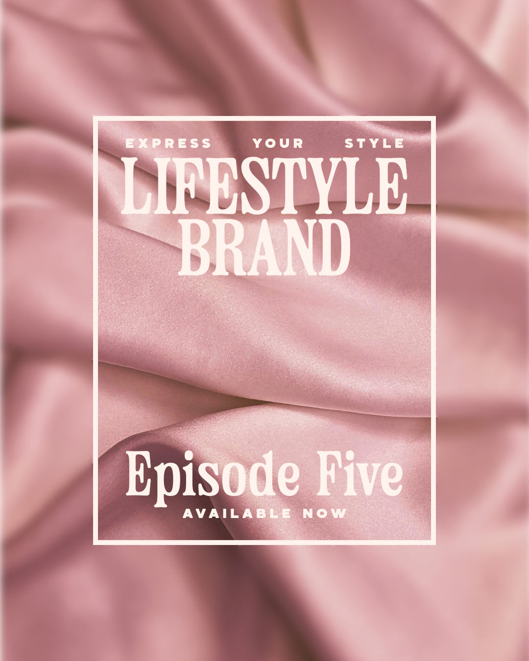
This technique works especially well when there’s one area of your image you want to emphasize while still keeping the context of the full photograph around it.
Step 1: Choose Your Focal Point
Start by bringing your selected photograph into Adobe Express and deciding which area you want to become the focus.
I like to add a simple square element over my image to act as a guide.
Position it over the area you want to keep sharp and adjust the size until you’re happy with your composition.
Step 2: Duplicate Your Photograph
Next, create a second copy of your original photo and make sure it’s positioned perfectly over the first.
Eventually, these two images are going to look like one continuous photograph, so keeping everything aligned is important.
Step 3: Crop Your Focused Image
Take the second copy and crop it to match the square we created as our guide.
The important part here is to crop the photograph from its original position.
Avoid repositioning the image itself while you’re cropping. This ensures that when the cropped copy is placed over the original photograph, everything still aligns perfectly.
Now you should have a small, sharp section of your photograph sitting directly over the matching area of the full image.
Step 4: Blur the Background
Select your original photograph underneath, head into Adjust, and find Blur.
Increase the blur until you have enough separation between the full photograph and the sharp cropped version sitting above it.
Suddenly, our eye is naturally drawn toward that focused portion of the image.
Step 5: Add the Finishing Details
Remember the square we originally used as our cropping guide? We can turn that into part of the finished design!
Adjust the fill and stroke to create a simple frame around your focused area. From here, you can add typography, a caption, additional graphic elements, or leave the design relatively simple and let your photograph do the work.
This effect is really just one photograph, two copies, and a little blur, but the difference in focus creates so much more depth.
Design Two: Layer Typography Into Your Photography
For our second design, we’re using layers to make typography feel like it actually exists within our photograph instead of simply sitting on top of it.
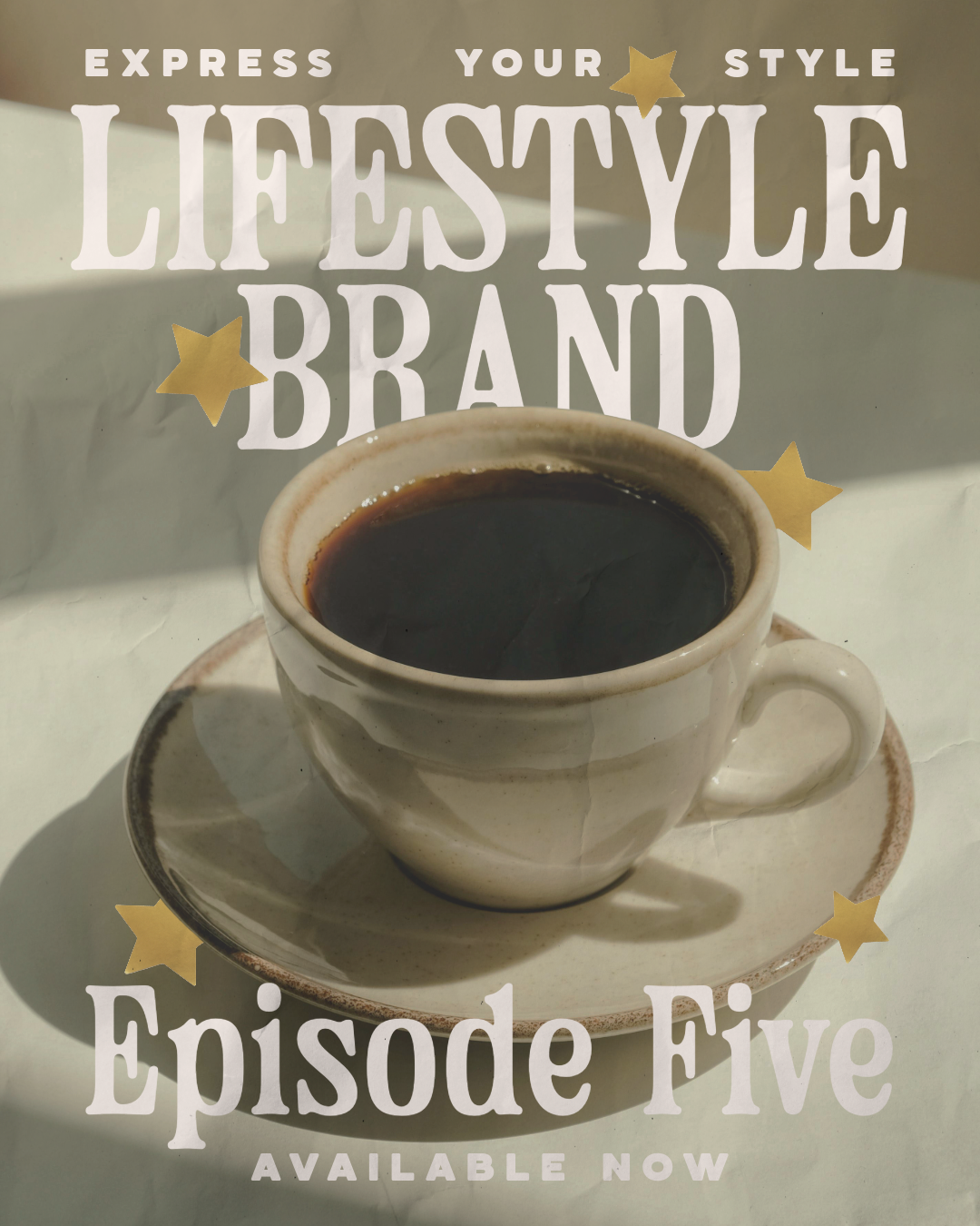
The trick here is separating the subject of our photograph from the background. Once we do that, we can start sandwiching typography and other design elements between the two.
Step 1: Isolate Your Subject
Start with your original photograph and identify the subject you want to bring forward.
Use Remove Background or the Erase tool to isolate that subject from everything surrounding it.
Depending on your photograph, this could be a person, product, object, cup of coffee, flower, piece of furniture, or anything else you want to interact with your typography.
Step 2: Restore Your Full Photograph
Create an additional copy of your image and use the same tools to restore the original photograph.
Now you should have two versions:
Your complete photograph
Your isolated subject
Position the full photograph on the bottom and the isolated version directly over it.
If everything is aligned correctly, it should look just like your original image.
But now we have a hidden little pocket between those two layers.
Step 3: Add Your Typography
Start adding your type and any additional graphic elements you want to include.
Instead of placing everything above your photograph, experiment with moving some of those elements between the full image and your isolated subject.
Now part of a word might disappear behind your subject while the rest remains visible.
You can let one word sit completely behind the subject while another sits completely on top.
You can even introduce additional shapes or graphic elements into those different layers.
The photograph itself hasn’t changed, but the typography suddenly feels like it’s interacting with the environment inside the image.
Step 4: Play With Your Layers
There isn’t necessarily one correct arrangement here.
Experiment with the layer order, typography scale, placement, and how much of each word you allow your subject to cover.
You still want your message to be readable, so avoid hiding so much of your typography that someone has to guess what it says.
The goal is simply to create enough overlap to give the composition a little more depth.
This is such a fun technique for lifestyle and personal brand content because you can keep the photograph relatively untouched while still making the final design feel much more dynamic.
Design Three: Create a Torn-Paper Photo Cutout
For our final design, we’re using an asset from the Adobe Express library to turn part of our photograph into its own torn-paper-inspired graphic element.
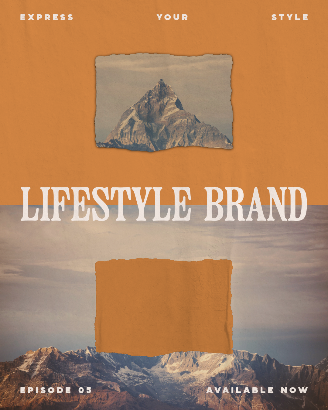
This one takes a few extra steps, but once you understand how the effect works, there are so many different ways you could use it.
Step 1: Position Your Photograph
Start by bringing your original photograph into the project and positioning it so it takes up about half of the page.
I’m intentionally leaving some open space in the composition because that’s where we’ll build the second part of our effect.
Step 2: Find Your Torn-Paper Asset
Head into the Adobe Express Asset Library and search for a torn paper element.
For this particular technique, look for something that is relatively blank in the center.
We want the photograph underneath to show through clearly, so avoid choosing an asset with lots of texture or graphics filling the center.
Position the asset over the portion of your original photograph that you eventually want to isolate.
Step 3: Create Your Working Copy
Select your photograph and torn-paper asset, create a copy, and move those duplicated elements into the open area of your canvas.
Now add a pure black rectangle over the copied photograph, making sure the torn-paper asset remains on the top layer.
Your layer order should essentially be:
Torn-paper asset → Black rectangle → Photograph
Step 4: Create the Cutout
Group your black rectangle and torn-paper asset together.
Select the group from the right-side panel and adjust the blend settings to Multiply.
This gives us the foundation for our torn-paper cutout effect.
And if you like how the design looks with the black area, you could absolutely stop here!
But naturally, I want an excuse to introduce a little more color.
Step 5: Isolate the Torn Photograph
Save your newly created design and bring the finished image back into your Adobe Express project.
Select the image and use Remove Background or the Erase tool to remove the black area surrounding your torn-paper photograph.
Then crop the image as needed until you’re left with just the isolated ripped-out section of your photo.
Now we have a completely separate graphic element that we can move around our composition however we want.
Step 6: Add Some Color
Place your new photo cutout back into the main design.
From here, you can add another element behind it to create a colorful background and use the Duotone effect on the original torn-paper asset to adjust its colors to match.
Add typography, additional elements, or keep things simple.
We started with one everyday photograph and ended up pulling a tiny portion of it out to create an entirely new graphic element.
Let the Photo Do the Storytelling
All three of these designs use different techniques, but they share one important idea: Your photography is still the foundation.
We aren't trying to hide it underneath a ton of design elements. Instead, we're finding small opportunities to interact with what's already there. We used blur and cropping to create focus. We used layering to weave typography into an image. And we used assets and image editing to turn part of a photograph into a completely new element. That can be especially useful when you're creating content around yourself, your creative work, your business, or your everyday life.
Not every photo needs to become a heavily designed graphic. And not every photo needs to stay completely untouched. There's a really fun space somewhere in between.
Ways to Use These Techniques in Your Own Content
The effects themselves can also be adapted to all kinds of content. Try selective blur for a product feature, outfit detail, workspace photo, announcement, or behind-the-scenes moment. Use layered typography for quotes, personal stories, educational content, introductions, campaign messaging, or Reel covers. And experiment with photo cutouts for travel content, mood boards, product features, photo dumps, creative recaps, or editorial-style layouts.
You can also completely change the aesthetic by swapping the typography, colors, photography, and assets. A technique isn't necessarily a style. It's simply another tool you can adapt to your style.
Remix the Templates in Adobe Express
Want to skip the blank canvas and start experimenting?
I've made all three designs available as remixable Adobe Express templates so you can customize them with your own colors, fonts, photography, messaging, and brand elements.
Use them exactly as they are, completely transform them, or simply use them as a starting point for your own scrapbook-inspired content.
Express Your Style
And just like that, we've officially made it through all five Design Studies in Express Your Style!
Throughout this series, we've explored scrapbook and collage design, minimalism, maximalism, animation, and finally lifestyle and personal brand content. Every episode has looked completely different, and that's kind of the point.
There isn't one right way to create. You can layer everything and embrace a scrapbook-inspired aesthetic. You can strip everything back and explore minimalism. You can fill the page with color and personality. You can make your designs move. Or you can start with a photograph you love and build from there. The fun part is experimenting with different styles, tools, and techniques until you start discovering what feels the most like you.
And hopefully, somewhere throughout these five Design Studies, you've discovered a new technique to try, a style you hadn't considered before, or simply a little inspiration to open Adobe Express and start creating.
Thanks so much for following along with Express Your Style and creating with me! 💗