How to Create Scrapbook & Collage Social Media Content in Adobe Express
If you love social media content that feels playful, layered, a little nostalgic, and full of personality, the scrapbook and collage aesthetic might be the perfect style to explore.
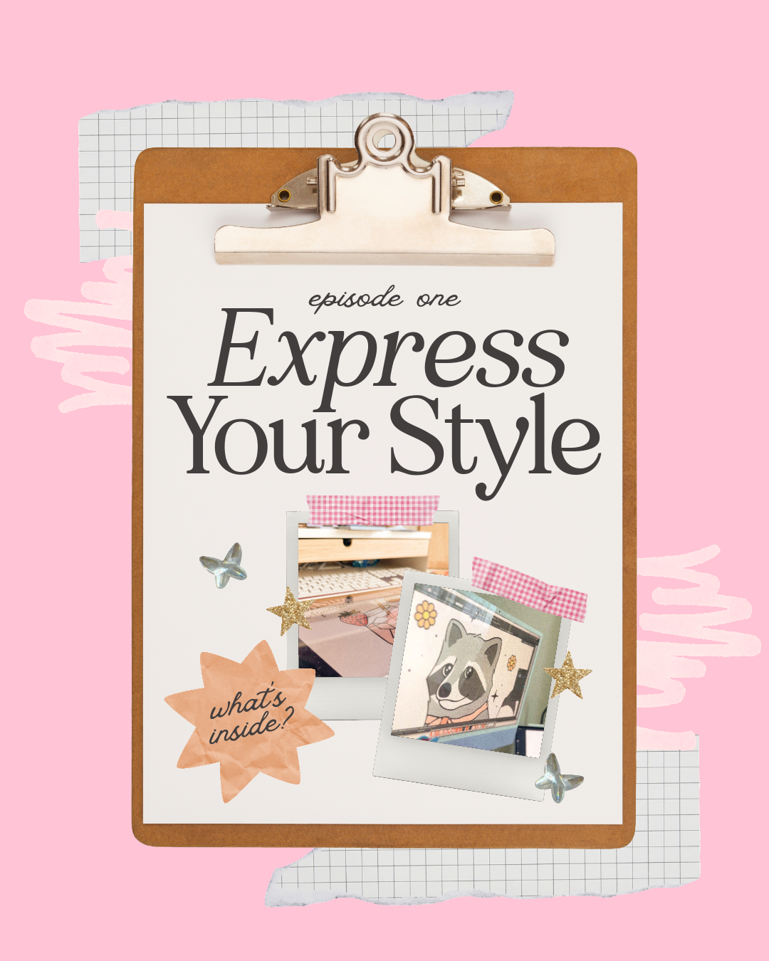
Welcome to the first installment of Express Your Style, a five-part creative series exploring different social media aesthetics and how you can recreate them using Adobe Express.
Throughout this series, I'll be breaking down the colors, typography, imagery, assets, and design choices that help define five completely different aesthetics. We'll also turn each style into a coordinated set of social media templates that you can remix and customize for your own content.
First up, we're diving into one of my personal favorites: Scrapbook & Collage!
The Style Snapshot
Before we start designing, let's break down what gives scrapbook-inspired content its signature look.
The Mood: Playful, nostalgic, expressive, handmade, and personal
Key Elements: Layered paper, tape, stickers, handwritten details, doodles, expressive typography, photography, imperfect shapes, and tactile textures
Color Direction: Playful, warm, and organic combinations that feel collected rather than overly coordinated
Perfect For: Lifestyle creators, artists, boutiques, cafés, photographers, florists, handmade businesses, personal brands, and anyone who wants their content to feel creative and approachable
The Design Goal: Create something that feels collected, layered, and handmade while still maintaining enough visual hierarchy to communicate clearly.
Why Scrapbook-Inspired Design Works
One of the reasons I love this aesthetic is that it embraces a little imperfection.
As social media has become increasingly polished, we're also seeing creators embrace visuals that feel more personal, tactile, and handmade. Scrapbook and collage design fits perfectly into that shift.
Instead of relying on perfectly aligned layouts, this style brings together overlapping photography, torn paper, handwritten notes, tape, illustrations, textures, and typography to create something that feels like it was physically assembled.
But there's an important distinction between a design that feels intentionally layered and one that simply feels cluttered.
The secret is still using the same fundamental design principles you would with any other aesthetic: hierarchy, balance, repetition, contrast, and consistency.
You're simply applying those principles in a much more playful way.
Creating a Scrapbook Mood Board
Before I begin designing, I like to establish a visual direction.
A mood board gives me a place to experiment with different colors, fonts, textures, imagery, and graphic elements before committing to an actual layout.
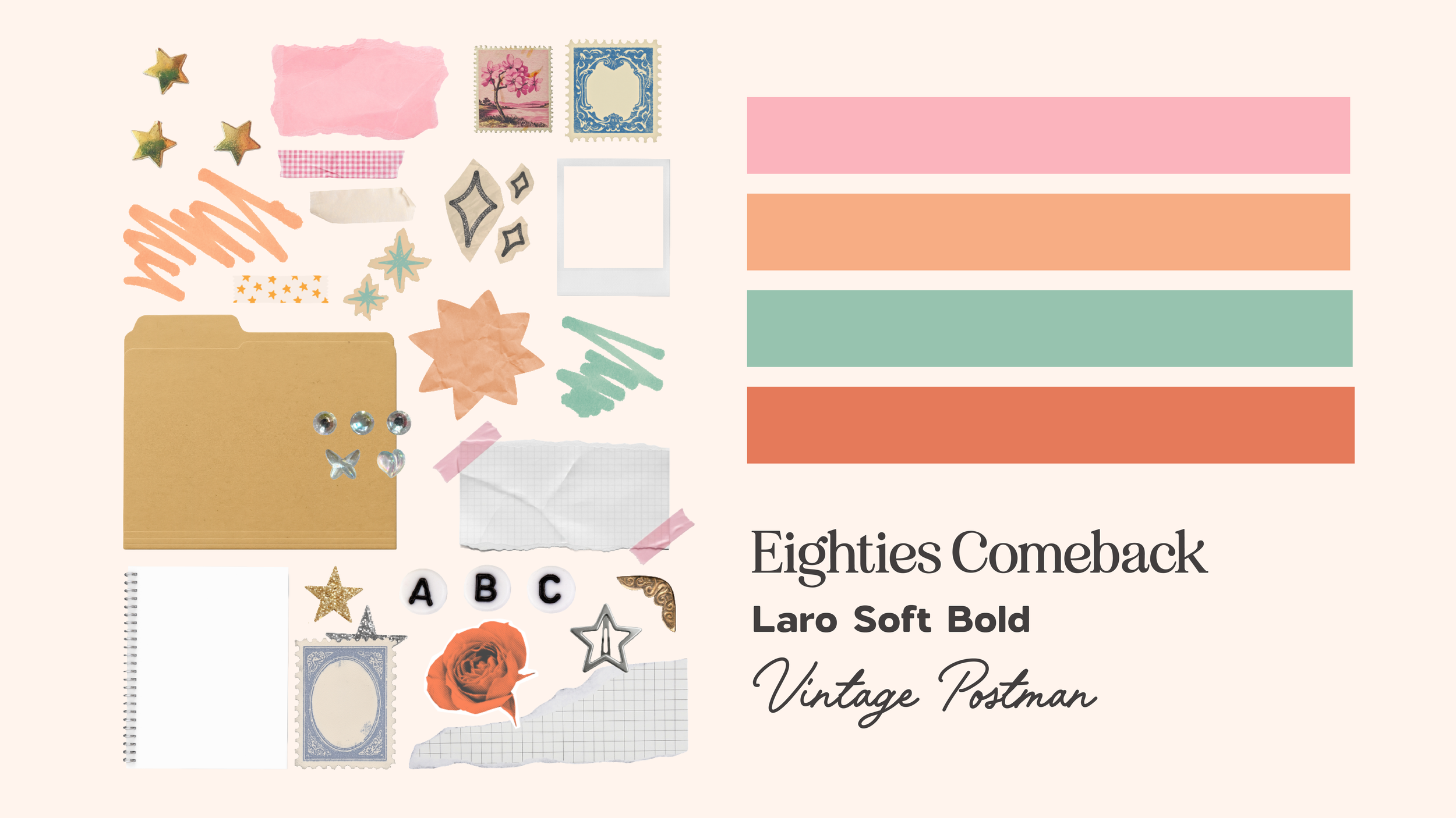
For this collection, I focused on gathering elements that immediately communicated the scrapbook aesthetic: paper textures, tape, labels, doodles, flowers, stars, handwritten graphics, photography, and playful typography.
You can find tons of these elements directly inside the Adobe Express asset library.
Adobe Express Search Terms to Try
If you're building your own scrapbook-inspired design, try searching the Elements library for terms like:
Paper & Texture
torn paper
ripped paper
paper texture
notebook paper
kraft paper
Details & Decorations
masking tape
washi tape
doodle
hand drawn
sticker
star
flower
arrow
label
Additional Style Keywords
scrapbook
collage
retro
handmade
journal
Don't feel like you need to use everything you find. Creating a small collection of repeating elements will actually help your designs feel more cohesive.
Building the Template Collection
For this Design Study, I created three social media templates that serve different purposes while sharing the same visual language.
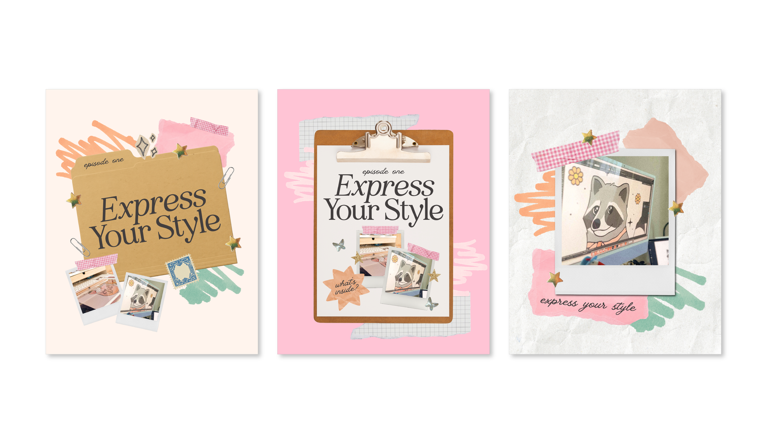
Template One: Announcement or Promotional Post
For the first design, I wanted to create something that could easily be adapted for a launch, announcement, event, product, or other promotional content.
Even with a playful aesthetic like scrapbook, I always begin with hierarchy.
Before adding a single sticker or piece of tape, decide what you want someone to notice first.
That message should become the focal point of your design.
From there, you can begin layering paper textures, secondary information, photography, tape, and decorative graphics around it.

Template Two: Carousel Cover
For the second template, I changed the composition while continuing to use the same colors, typography, textures, and graphic elements.
This is an important distinction when you're building a social media content system.
Consistency does not mean repetition.
Your layouts can change dramatically while your overall visual language remains recognizable.
Repeating a handful of colors, fonts, textures, and graphic elements across your content is often enough to make completely different layouts feel connected.
Template Three: Photo-Focused Content
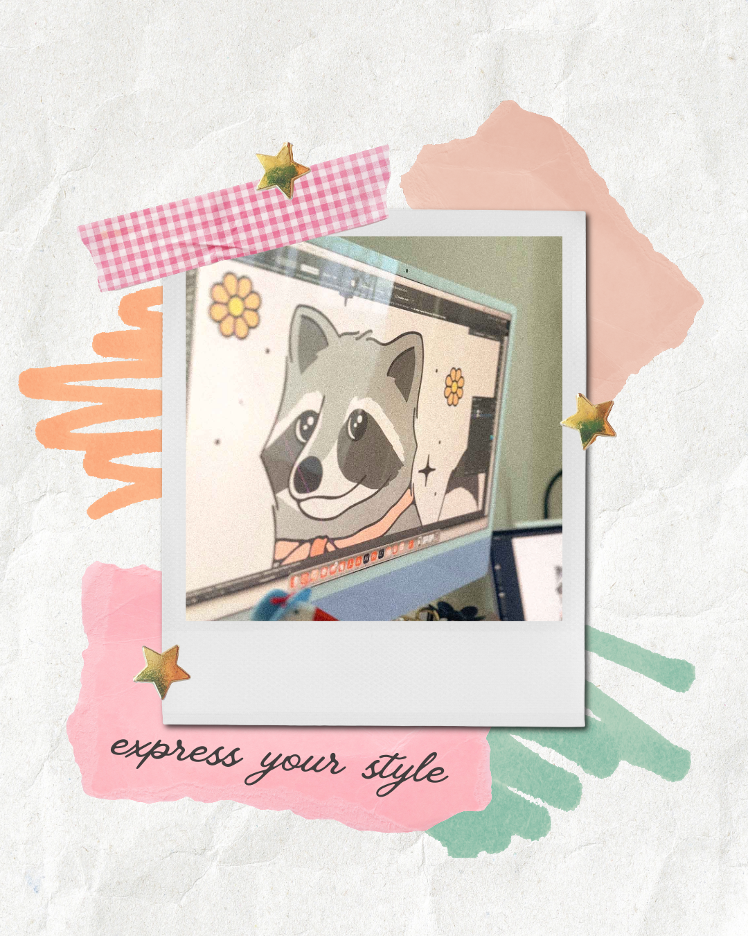
For the final template, I wanted photography to become the focal point.
When I'm designing around a photo, I try to let the image tell most of the story.
Instead of covering it with decorative elements, I use scrapbook details around the image to help frame it. A little tape, a handwritten note, overlapping paper, or a strategically placed sticker can communicate the aesthetic without competing with the photograph.
The Secret to Making Scrapbook Designs Feel Cohesive
Scrapbook design gives you permission to play, but that doesn't mean everything needs to be different.
In fact, repetition is what makes the playful elements work.
Across a collection of content, try repeating:
The same core color palette
One or two primary typefaces
A small collection of stickers or illustrations
Similar paper textures
Consistent photography treatments
A handful of recurring decorative elements
Then change your compositions.
That balance gives you content that feels varied enough to stay interesting while still being recognizable as part of the same brand.
What Types of Brands Work Well With This Aesthetic?
One of my favorite things about exploring different design styles is thinking about where they might naturally fit.
Scrapbook and collage-inspired content can work especially well for:
Lifestyle creators
Personal brands
Artists and illustrators
Photographers
Boutiques
Handmade businesses
Cafés and coffee shops
Florists
Bookstores
Stationery brands
Travel and hospitality brands
Creative small businesses
But these aren't rules.
Even if scrapbook design doesn't perfectly match your existing brand, you can borrow individual ideas from the aesthetic.
Maybe that's introducing a handwritten accent. Maybe it's layering photography over a subtle paper texture. Maybe it's adding a little imperfection to an otherwise polished content system.
Exploring different aesthetics isn't necessarily about completely changing your style. It's about discovering new tools you can add to your creative toolbox.
Remix the Templates in Adobe Express
Want to skip the blank canvas and start experimenting?
I've made all three designs available as remixable Adobe Express templates so you can customize them with your own colors, fonts, photography, messaging, and brand elements.
Use them exactly as they are, completely transform them, or simply use them as a starting point for your own scrapbook-inspired content.
Express Your Style
That's a wrap on our first Design Study!
My biggest takeaway from scrapbook and collage design is that intentional doesn't have to mean perfect.
Layer things. Experiment with scale. Move something slightly off-center. Add texture. Mix photography with illustration. Let your designs have a little personality.
And most importantly, have fun with it.
Next up in Express Your Style, we're heading in almost the complete opposite direction as we explore Minimal & Balanced Content and how typography, spacing, hierarchy, and restraint can create just as much visual impact.
I'll see you in Design Study 02!