How to Create Minimalist Social Media Content in Adobe Express
If you love social media content that feels clean, intentional, elevated, and effortlessly put together, minimalism might be the perfect design style to explore.
Welcome back to Express Your Style, a five-part creative series exploring different social media aesthetics and how you can recreate them using Adobe Express.
In our first Design Study, we embraced all things layered, textured, and playful with scrapbook and collage design. This time, we're heading in almost the complete opposite direction and stripping things back as we explore minimalism.
We'll look at the colors, typography, spacing, photography, and design decisions that help minimalist content feel refined rather than empty, then turn those ideas into three coordinating social media templates you can remix for your own content.
The Style Snapshot
Before we start designing, let's break down some of the visual characteristics that give minimalist content its signature look.
The Mood: Clean, refined, intentional, timeless, and elevated
Key Elements: Strong typography, intentional white space, simple shapes, photography, clean lines, subtle graphic elements, and structured layouts
Color Direction: Neutral, restrained, and intentional. Minimalism definitely doesn't have to mean beige, but limiting your palette can help create a clean and cohesive visual system.
Perfect For: Fashion and beauty brands, wellness businesses, photographers, interior designers, personal brands, service-based businesses, and anyone looking for an elevated content style
The Design Goal: Create visual impact through hierarchy, balance, spacing, scale, and intentional choices rather than relying on lots of decorative elements.
Why Minamalist Design Works
Minimalism is one of those design styles that can look incredibly simple at first glance, but creating something that feels intentionally simple is often more challenging than it seems.
When you remove decorative graphics, textures, stickers, and other visual details, your core design decisions become much more noticeable.
Your typography matters, spacing matters, alignment matters, hierarchy matters. That's exactly what makes minimal design so impactful.
Minimalism isn't necessarily about using as little as possible. Instead, it's about being intentional with what you choose to include. Every element should have a reason for being there.
Instead of adding more to make a layout feel interesting, we can create contrast through typography, experiment with scale, introduce asymmetry, use photography strategically, and give important information plenty of room to breathe.
Sometimes the strongest design decision you can make is deciding not to add something else.
Creating a Minimalist Mood Board
Before I begin designing, I like to establish a visual direction.
A mood board gives me a place to experiment with different colors, fonts, textures, imagery, and graphic elements before committing to an actual layout.
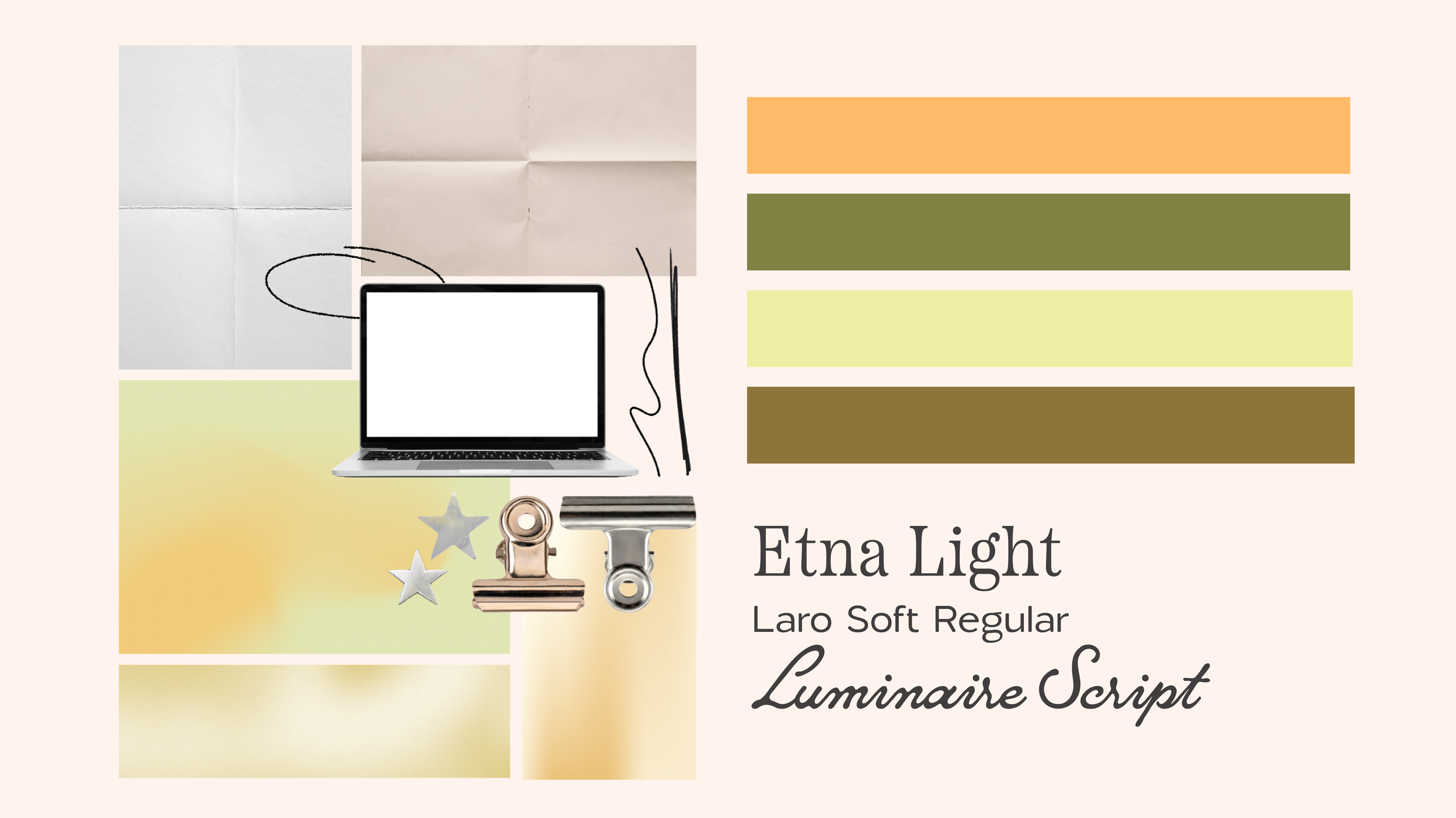
For this collection, I'm looking for inspiration that feels clean and refined while still having plenty of personality.
The goal isn't to find a bunch of things I want to recreate exactly. Instead, I'm looking for patterns that help me understand the visual language of the style.
Once I start noticing those patterns, I can bring those same principles into my own designs.
Adobe Express Search Terms to Try
When creating your own minimalist content, try searching for terms like:
Shapes & Details
line
organic shape
outline
frame
border
grid
geometric
minimal
Photography & Texture
neutral
editorial
shadow
architecture
minimal photography
abstract
paper
You don't need to use all of these in one design. Choose a few elements that complement your content and repeat them throughout your template system.
Choosing a Minimal Color Palette
Minimalist design is often associated with neutral colors, but minimalism doesn't have to mean black, white, cream, and beige.
You can absolutely create a minimalist design system using color, the key is restraint. Instead of introducing a new color every time the layout needs visual interest, try choosing a small core palette and finding different ways to use it.
Limiting your palette also makes it much easier to create consistency across multiple pieces of content.
Let Typography Do the Work
Typography is one of the most powerful tools you have when creating minimalist content.
When there aren't a ton of decorative elements competing for attention, your type can become part of the visual identity itself.
Experiment with:
Large differences in scale
Contrasting font weights
Serif and sans serif pairings
Small supporting copy
Oversized headlines
Letter spacing
Alignment
Line breaks
You don't necessarily need another graphic to make a composition more interesting.
Sometimes making one word dramatically larger or shifting a headline to an unexpected position is enough, the important thing is maintaining clear hierarchy.
Ask yourself: What should someone notice first? What should they read next? What information is supporting everything else?
Those questions can guide almost every decision you make.
Building the Template Collection
For this Design Study, I created three social media templates that serve different purposes while sharing the same visual language.
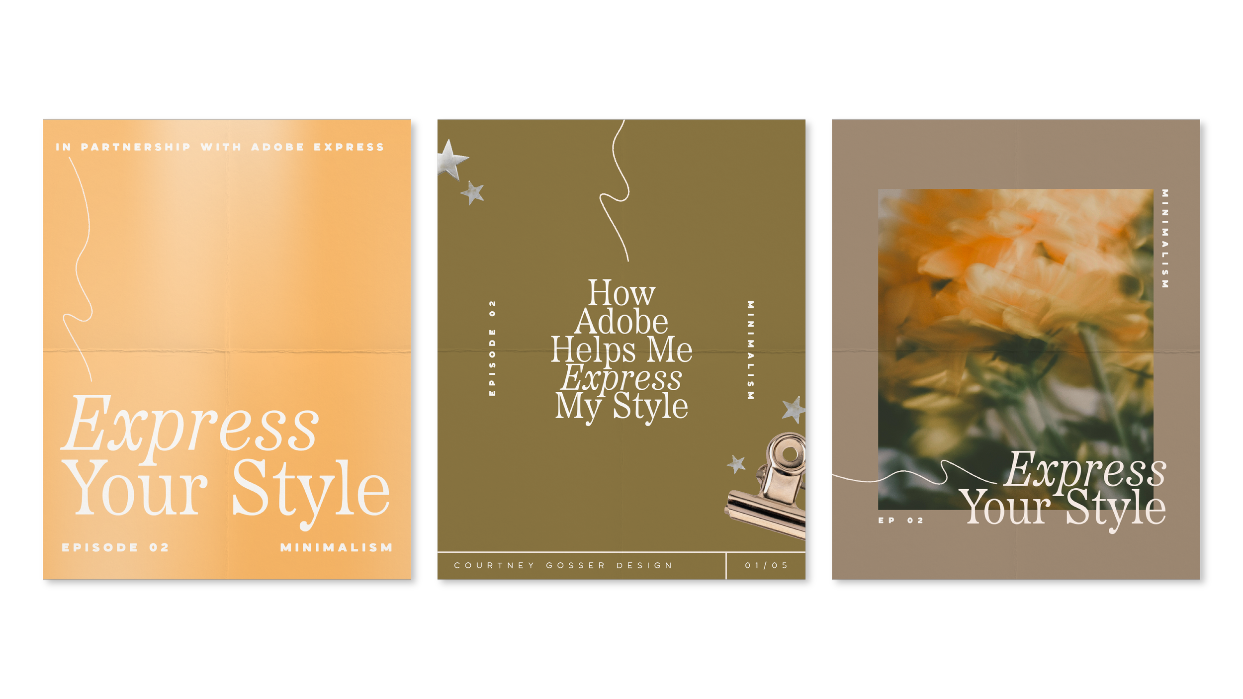
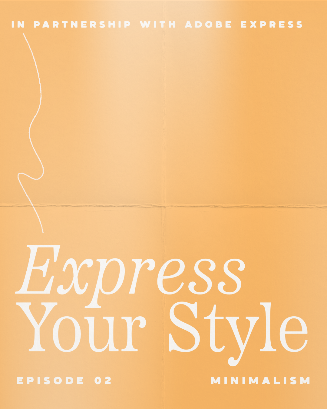
Template One: Announcement or Promotional Post
For the first design, I'm creating something that can easily be adapted for an announcement, launch, event, product, service, or promotion.
Before adding anything decorative, I start with the content.
The most important message becomes the focal point, and everything else is arranged around that hierarchy. From there, typography, scale, and spacing create most of the visual interest.
One of the most important elements in this layout isn't actually an element at all. It's the white space surrounding everything.
White space isn't wasted space. It helps separate information, establish hierarchy, create emphasis, and give your design room to breathe.
Template Two: Carousel Cover
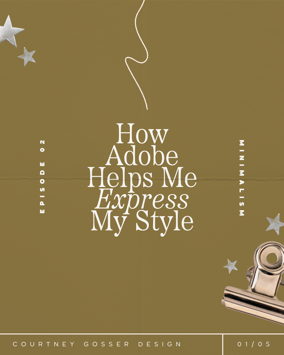
For our second design, I'm using the same colors and typography while experimenting with a different composition.
One misconception about minimalist design is that everything needs to be perfectly centered and symmetrical, but it doesn't. Asymmetrical layouts can still feel incredibly clean and balanced.
Think about the visual weight of each element rather than simply whether everything lines up perfectly. A large headline on one side of the composition might be balanced by a much smaller image or piece of text on the other.
This is also where scale becomes incredibly useful. Instead of adding another element, try changing the relationship between the elements you already have.
Template Three: Photo-Focused Content
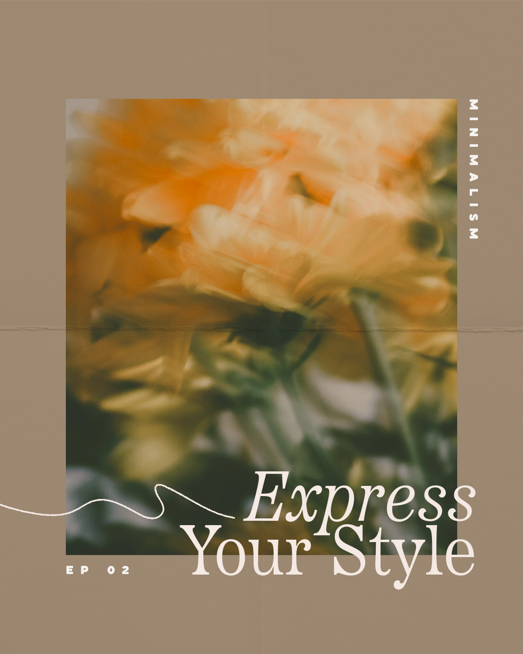
For the final template, I'm bringing photography into the content system.
Photography works beautifully with minimalist design because the image itself can provide much of the personality and visual interest. Instead of covering the photo with lots of graphics, I want to let it become the focal point.
Cropping, scale, and placement can completely change how an image interacts with your layout, so I like experimenting with those decisions before adding anything else.
From there, typography and a few subtle details can support the image without competing with it.
The Secret to Making Minimal Content Interesting
Minimal does not have to mean boring.
If your layout feels like it's missing something, your first instinct might be to add another graphic, color, font, or decorative element.
Before you do, try changing what's already there.
Make something bigger, or smaller.
Move your headline, increase the space between elements.
Change your alignment.
Crop your photograph differently.
Introduce contrast through typography.
Minimalism encourages you to create visual interest through relationships rather than quantity. That's a skill you can carry into almost any design style.
What Types of Brands Work Well With This Aesthetic?
Minimalist social media content can work particularly well for:
Fashion brands
Beauty and skincare businesses
Wellness brands
Photographers
Interior designers
Architects
Personal brands
Consultants
Service-based businesses
Creative studios
Luxury brands
Editorial-style businesses
But just like every aesthetic we explore throughout this series, these aren't rules. You don't need a completely minimalist brand to borrow ideas from minimalist design.
Exploring different aesthetics is less about completely changing your style and more about discovering new tools you can add to your creative toolbox.
Remix the Templates in Adobe Express
Want to skip the blank canvas and start experimenting?
I've made all three designs available as remixable Adobe Express templates so you can customize them with your own colors, fonts, photography, messaging, and brand elements.
Use them exactly as they are, completely transform them, or simply use them as a starting point for your own scrapbook-inspired content.
Express Your Style
That's a wrap on Design Study 02!
If there's one thing I hope you take away from this style, it's that you don't need a lot happening to make an impact with your design.
Minimalism is about utilizing white space, creating balance, establishing strong hierarchy, and choosing a few curated elements that work together to create something refined.
Sometimes adding personality means adding more.
And sometimes the best thing you can do for your design is take something away.
Next up in Express Your Style, we're swinging the pendulum in the other direction as we explore Bold & Maximalist Content and how expressive color, energetic typography, layered visuals, and playful compositions can create a completely different kind of impact.
I'll see you in Design Study 03!