How to Create Bold & Maximalist Social Media Content in Adobe Express
If you love social media content that feels colorful, expressive, energetic, and basically impossible to scroll past, maximalism might be the perfect design style to explore.
Welcome back to Express Your Style, a five-part creative series exploring different social media aesthetics and how you can recreate them using Adobe Express.
In our last Design Study, we stripped everything back with minimalism and explored how white space, typography, balance, and restraint can create visual impact. This time, we're swinging all the way in the other direction and exploring Bold & Maximalist Design.
We'll look at how color, typography, graphics, pattern, photography, and layering can work together to create content that feels full of personality without becoming completely chaotic. Then, we'll turn those ideas into three coordinating social media templates you can remix for your own content.
The Style Snapshot
Before we start designing, let's break down some of the visual characteristics that give maximalist content its signature energy.
The Mood: Bold, energetic, expressive, playful, and confident
Key Elements: Oversized typography, bright color, layered graphics, patterns, expressive imagery, unexpected shapes, playful illustrations, and lots of contrast
Color Direction: Bright, expressive, and unexpected. Maximalism gives you permission to use more color, but repeating a core palette helps everything feel intentional.
Perfect For: Food and beverage brands, fashion and beauty, entertainment, events, restaurants, artists, creative businesses, product-based brands, and anyone looking for an energetic and attention-grabbing content style
The Design Goal: Create abundance without chaos by using hierarchy, repetition, balance, and contrast to bring lots of different elements together.
Why Minamalist Design Works
Maximalism can look like a design style with absolutely no rules.
But great maximalist design usually has much more structure underneath the surface than you might initially notice.
The goal isn't necessarily to make every element compete for attention. It's about creating an energetic visual experience while still giving the viewer somewhere to look first. Because if everything is shouting, nothing actually feels loud. That's why hierarchy becomes even more important when you're working with a lot of visual elements.
Maximalism gives you permission to experiment, but hierarchy, repetition, balance, and contrast are what turn that experimentation into an intentional design.
Creating a Minimalist Mood Board
Before I begin designing, I like to establish a visual direction.
A mood board gives me a place to experiment with different colors, fonts, textures, imagery, and graphic elements before committing to an actual layout.
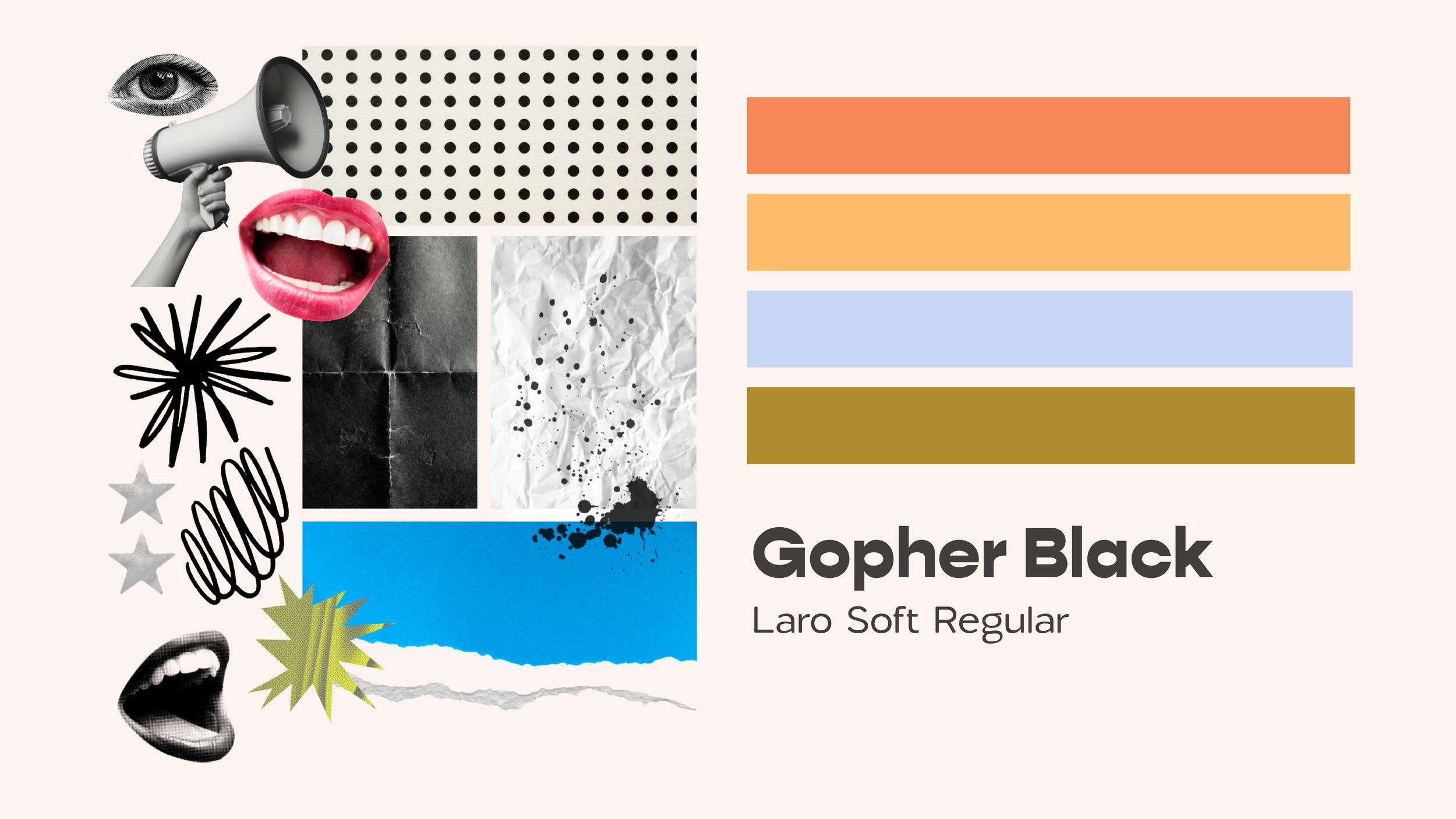
Mood boarding is especially helpful for maximalism because there are so many different directions the aesthetic can take.
You could create something retro and funky, colorful and youthful, editorial and expressive, playful and illustrated, or completely unexpected.
For this collection, I'm looking for inspiration that feels bold, colorful, energetic, and fun.
I'm paying attention to things like:
Oversized typography
Unexpected type combinations
Bright color palettes
Layered photography
Patterns
Expressive illustrations
Bold shapes
Repeating graphics
Overlapping elements
Compositions that aren't afraid to fill the page
The goal isn't to use every idea I find. Instead, I'm looking for patterns that can help establish the visual language for this particular collection.
Adobe Express Search Terms to Try
This is where exploring the Adobe Express asset library becomes especially fun.
Unlike our minimal Design Study, where we were intentionally selective with graphic elements, maximalism gives us much more room to experiment.
Adobe Express Search Terms to Try
If you're creating your own maximalist content, try searching for terms like:
Shapes & Graphics
abstract
burst
star
squiggle
blob
hand drawn
doodle
sticker
arrow
flower
geometric
Patterns & Texture
checkerboard
stripes
wavy
retro pattern
halftone
grain
paper texture
colorful pattern
Style Keywords
maximalist
bold
retro
funky
playful
colorful
eclectic
pop art
You definitely don't need to use everything you find. Instead, collect a group of assets that feel like they belong to the same visual world and repeat those throughout your designs. That repetition is going to become incredibly important once we start layering.
Choosing a Bold Color Palette
Maximalism gives us permission to play with color, but that doesn't necessarily mean choosing every color available. I still like establishing a core palette before I begin designing.
The difference is that this palette might include more colors, stronger contrast, or combinations I wouldn't normally use in a more restrained aesthetic. You can experiment with complementary colors, unexpected pairings, bright accents, or even several saturated colors working together.
The key is repetition. If the same colors continue appearing throughout your templates, even unexpected combinations start feeling intentional.
Let Typography Have Fun
Typography can become one of the biggest visual elements in maximalist design.
Instead of treating type as something that simply communicates information, think about how it can contribute to the overall personality of the layout.
Try experimenting with:
Oversized headlines
Dramatic differences in scale
Bold typefaces
Expressive display fonts
Unexpected font pairings
Stacked typography
Curved or angled text
Repeated words
Outlined or dimensional type
Type layered with photography and graphics
But even when you're experimenting, hierarchy still matters. Ask yourself: What should someone read first? That message should remain visually dominant. Everything else can have fun around it.
Building the Template Collection
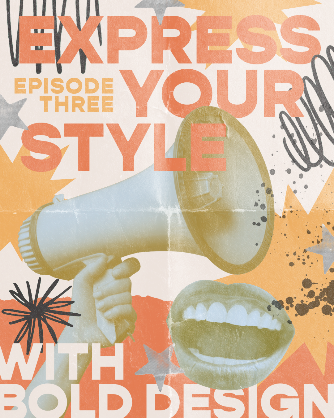
For this Design Study, I created three social media templates that serve different purposes while sharing the same bold visual language.
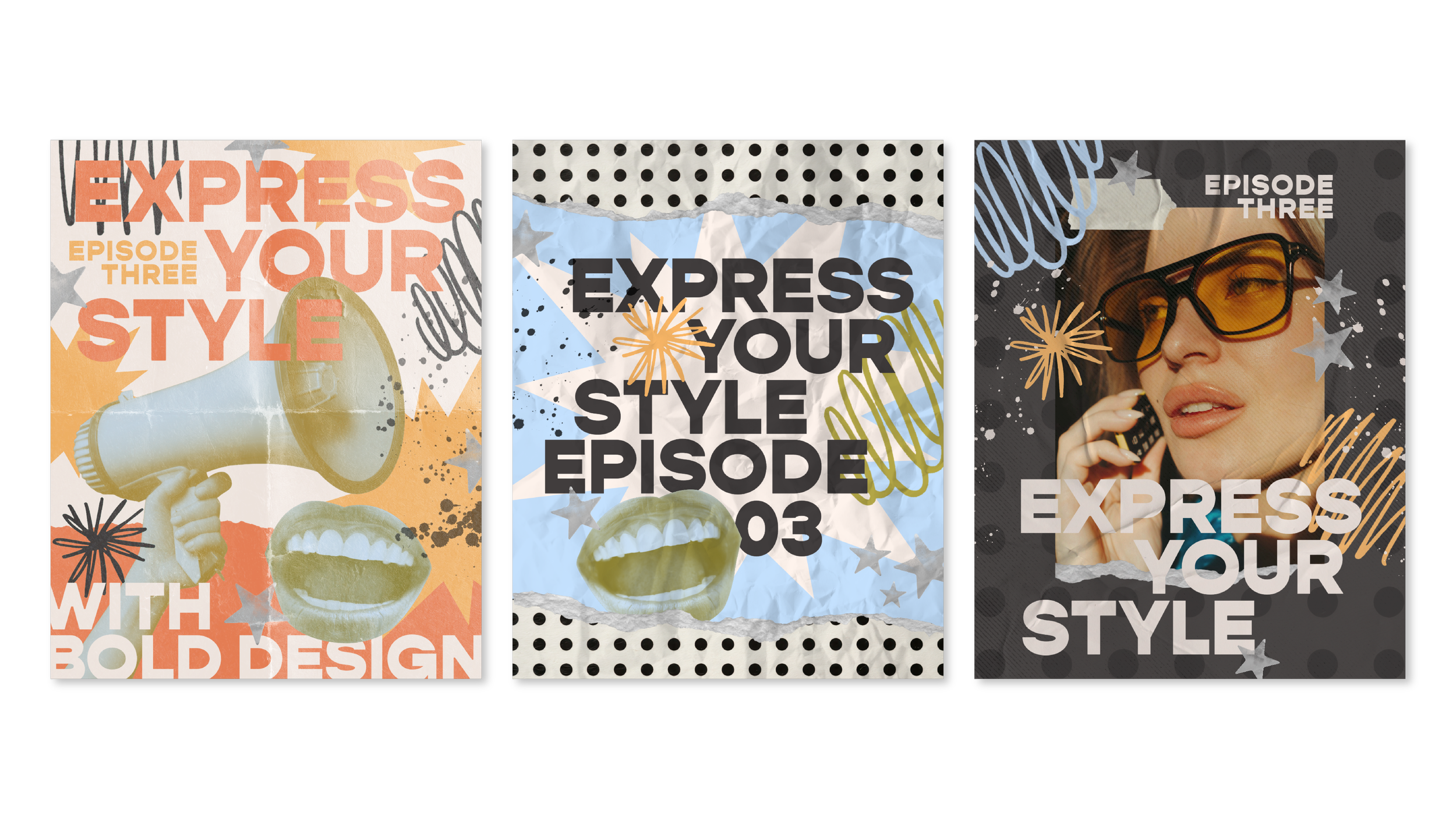
Template One: Announcement or Promotional Post
For our first design, I'm creating something that can easily be adapted for an announcement, launch, event, product, service, or promotion. I'm starting with the same question I've asked throughout this entire series: What should someone notice first?
My headline becomes the focal point, and I'm using oversized typography to make sure it stands out even as we begin introducing more elements.
From there, I can layer in color, shapes, graphics, and supporting information. Scale becomes especially helpful here. When some elements are dramatically larger and others stay intentionally small, we create contrast and movement throughout the composition.
There's a lot happening, but not everything has equal importance. That's what keeps the design readable.
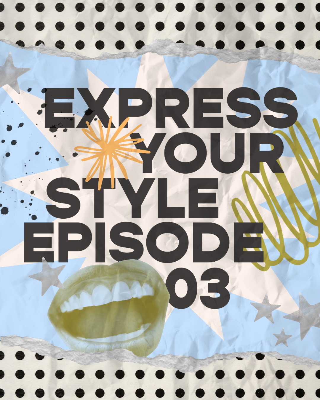
Template Two: Layering Without Losing Cohesion
For our second design, I'm leaning even further into layering.
I'm bringing in the same colors, typography, shapes, and graphic elements from our first template while rearranging them into a completely different composition.
This is where repetition becomes incredibly important. If every single element is different, a maximalist design can start feeling disconnected very quickly.
Instead, try repeating:
Colors
Fonts
Shapes
Patterns
Illustrations
Typography treatments
Photography styles
Those repeated elements create familiarity within all of the visual variety. It gives you the freedom to experiment with completely different compositions while still creating a recognizable content system.
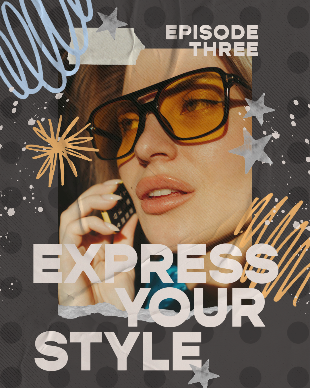
Template Three: Photo-Focused Content
For our final template, I'm bringing photography into the collection.
This is where we can see a major difference between maximalism and the minimal style we explored in our last Design Study. With minimalism, we gave our photography lots of breathing room.
Here, I'm letting the design interact with the photograph. Typography can overlap it. Graphics can frame it. Shapes can sit behind or in front of it. The photograph can even become another layer within the composition. But we still need to decide what's most important.
If the image is the focal point, the surrounding graphics should help emphasize it. If the message is more important, the photography might become a supporting visual instead.
Maximalism gives you freedom, but hierarchy gives that freedom direction.
What Types of Brands Work Well With This Aesthetic?
Bold and maximalist social media content can work particularly well for:
Food and beverage brands
Restaurants and cafés
Fashion brands
Beauty businesses
Events
Entertainment brands
Artists and illustrators
Product-based businesses
Creative studios
Music and entertainment
Youthful lifestyle brands
Personal brands with bold personalities
But these aren't rules. You don't need a maximalist brand identity to borrow ideas from maximalism. Try introducing an oversized headline into an otherwise simple layout. Experiment with an unexpected color combination. Layer typography over a photograph. Add a playful pattern. Let two elements overlap.
Exploring an aesthetic doesn't mean completely changing your visual identity. Sometimes borrowing just one principle is enough to make your content feel fresh.
Remix the Templates in Adobe Express
Want to skip the blank canvas and start experimenting?
I've made all three designs available as remixable Adobe Express templates so you can customize them with your own colors, fonts, photography, messaging, and brand elements.
Use them exactly as they are, completely transform them, or simply use them as a starting point for your own scrapbook-inspired content.
Express Your Style
That's a wrap on Design Study 03!
If there's one thing I hope you take away from this aesthetic, it's that more can absolutely be more when it's intentional.
Don't be afraid of color. Don't be afraid of oversized typography. Don't be afraid to layer, overlap, mix, experiment, and fill the space. Maximalism gives you permission to play.
The trick is making sure hierarchy, repetition, balance, and purpose are working underneath all of that personality to hold everything together. And sometimes, giving yourself permission to step outside your normal design habits is exactly how you discover something new.
Next up in Express Your Style, we're introducing an entirely new ingredient as we explore Animated & Dynamic Content and how movement can completely change the way someone experiences your design.
I'll see you in Design Study 04!