PROJECT OVERVIEW
Dear Marjorie
Brand Identity Design
Dear Marjorie Botanicals is a heartfelt project inspired by a deep love for greenery and the beauty of nature’s simplest gifts. Celebrated for its strong female ownership and genuine community ties, Dear Marjorie serves as a love letter to florals and plants—crafted by dreamers and gifted to those who cherish caring for something special.
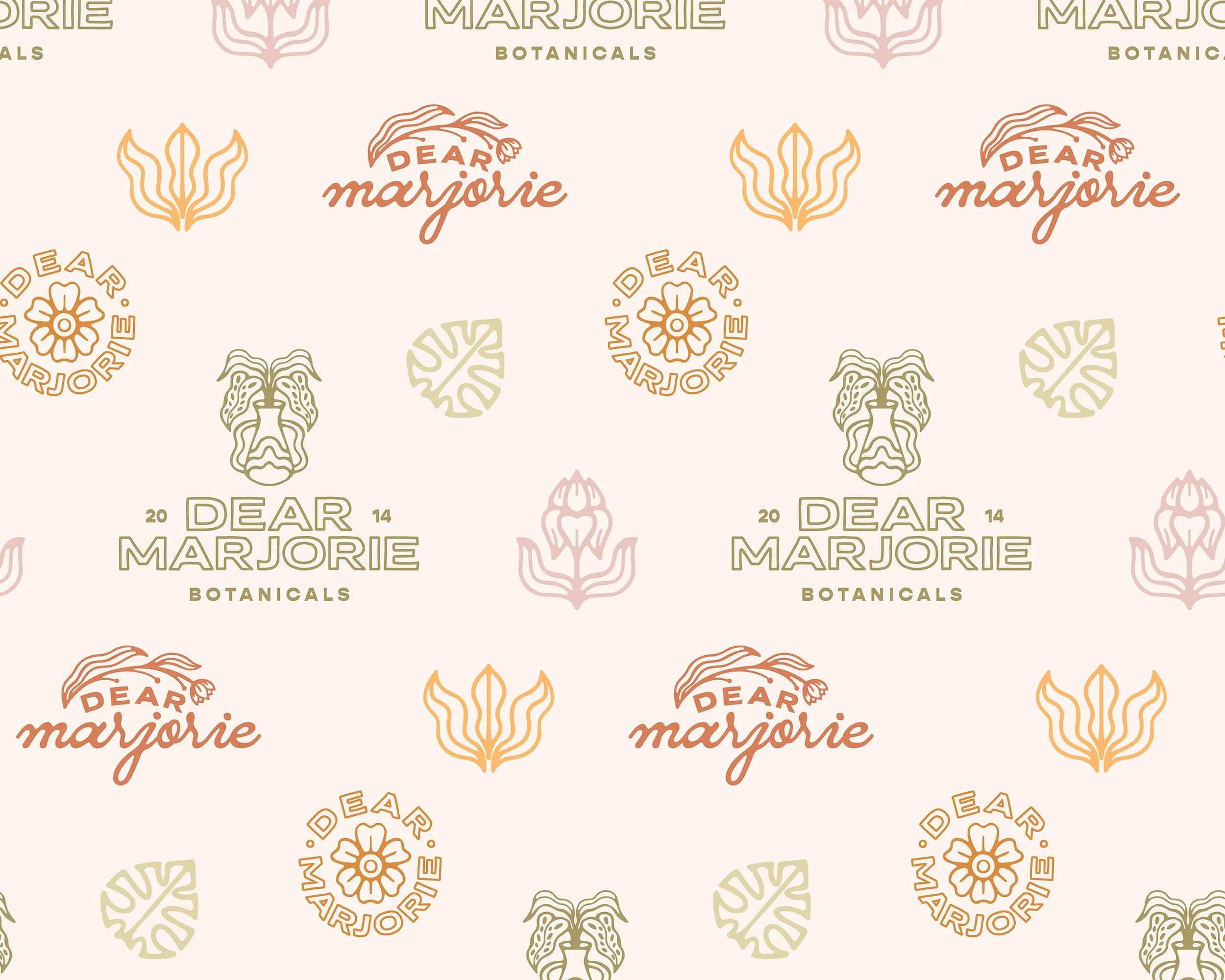
The brand’s organic charm and playful product lineup are captured through hand-drawn visual elements that reflect its unstructured, minimalistic style. These illustrations harmonize across the brand identity, shaping the color palette, icons, and social media and marketing assets, bringing the Dear Marjorie experience to life in a uniquely connected way.
PROJECT INSIGHT
The atmosphere of Dear Marjorie Botanicals is as organic and carefree as the product selection carried.
The target audience resonates most with simple, organic, and clean aesthetics, but it is also important to incorporate warm and inviting Earthy tones to connect Dear Marjorie to the organic roots it has been built upon.


COLOR PALETTE
A modern pairing of Earth’s richest tones, highlighting the hues and depth of Dear Marjorie’s products.
BASIL
GOLD RUSH
AGAVE
MORNING BIRD
ORCHID
TERRACOTTA